Map visualization tool made for humans
Create custom static
and interactive maps in seconds
No sign up required.
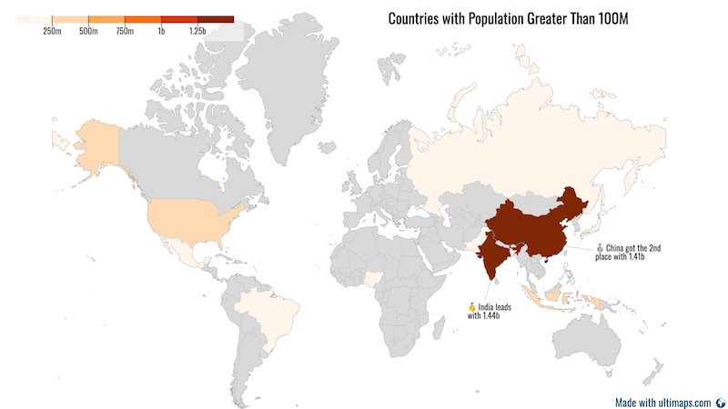
Maps with numerical data
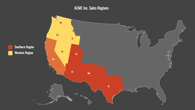
Sales territory maps
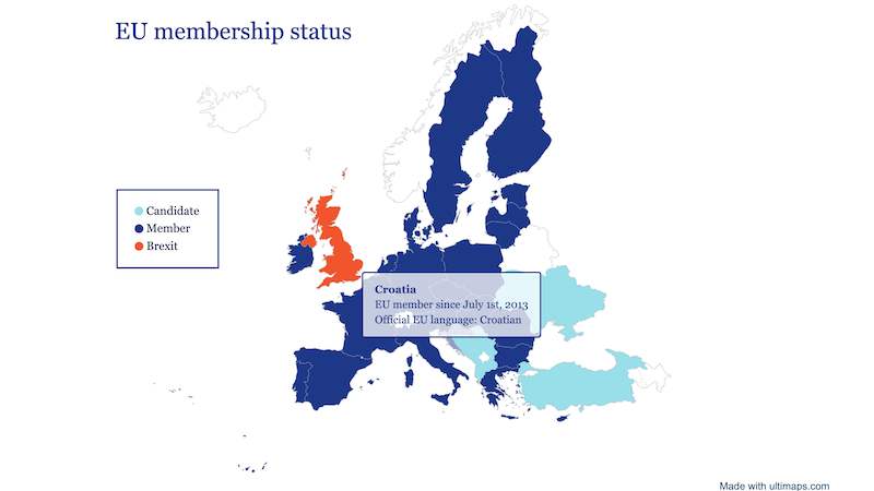
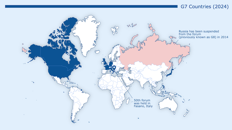
Maps with categorical data
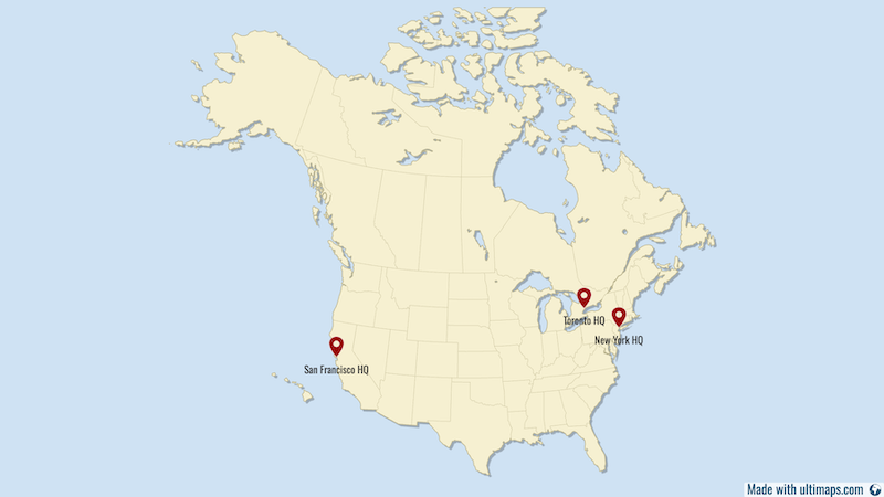
Maps with pins
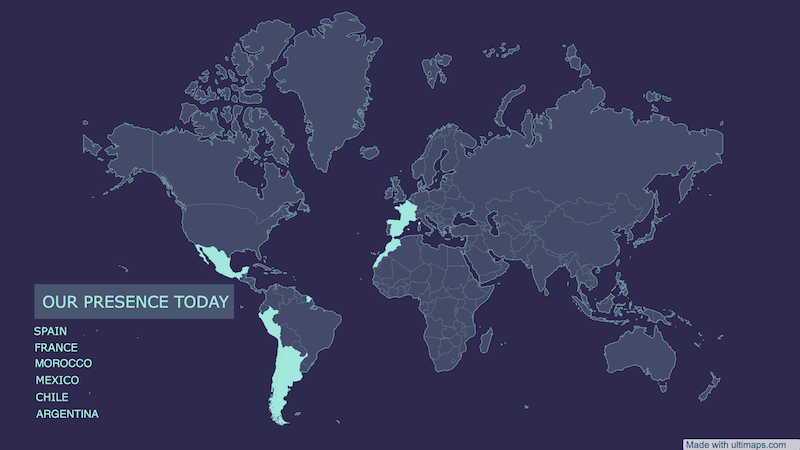
Presense maps
Illustrations
Smart Map Coloring
Turn messy spreadsheets into self-explanatory maps—no design skills needed.
We optimize colors, scales, and legends so your audience actually understand the data.
Import Data


Write a Prompt
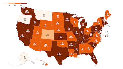
Using orange palette, color states based on the data below:
Alabama 4%
Alaska 0%
Arizona 5.6%
Arkansas 6.5%
California 7.25%
...
Our Algorithm Analyses

Smart Scaling
Dynamically selects gradients or stepped colors - with steps intelligently calculated to match your data's natural breaks
Picks the Perfect Palette
Sequential, diverging, multi-color—we pick the right palette for your data type.
Builds a Legend & Formats Values
$ vs %, decimals vs whole numbers - we'll adapt
Fixes Inconsistent Data
New York, NY, NewYork, or even Nueva York? We'll recognize them all
Approve or Tweak
Tweak Styles
Fine-tune colors, fonts or add annotations and pins
Export or Embed
Download in PNG, SVG, PDF or turn into an interactive map
Feel Creative?
Apply one of our themes to skip straight to presentation-ready maps or use Bucket Fill for manual coloring
Make Your Maps Unique
Add Annotations
Add text, lines, and shapes - no design tools needed.
Build Interactive Maps
with No Line of Code
- Make your visualizations live with interactive elements, such as tooltips and popups
- Publish and share your maps via link
- Embed on your website
- Works on any device
this is interactive map - try it
open in a new tab
Pricing
Our core features will always stay free.
Basic
Free
Our generous free tier allows you to use Ultimaps to its full potential. No sign-up required unless you need to share or embed your maps.
Go to StudioWhat's included:
- Unlimited Maps
- Export Maps to PNG with Attribution
- Store Maps in Your Account
- Create Maps from Files or using AI
- Share and Embed Interactive Maps
Pro
€49/month
Best for those who publish maps on a regular basis or need a white-label version. Priority support via email included.
Get StartedEverything in Free and:
- Export to High Resolution PNG without Attribution
- Export to SVG and PDF
- Create Reusable Templates
- 5,000 Geocoding Requests and 500 AI Requests per month
- 1 Workspace User
Custom
Contact Us
Best for large companies, business owners who needs a custom mapping or visualization solution.
Contact UsEverything in Pro and:
- Private Sharing of your Maps
- Invite Users to your Workspaces
- Custom Themes
- Custom Interactive Logic
Let's talk!
Do you have any questions about our product?
Are you looking for a custom solution for your next project?
We specialize in data visualization, GIS and software development in general. Send us a note below and we'll be happy to assist you.