Getting Started with Ultimaps Studio
1. Open the Studio and pick a base map
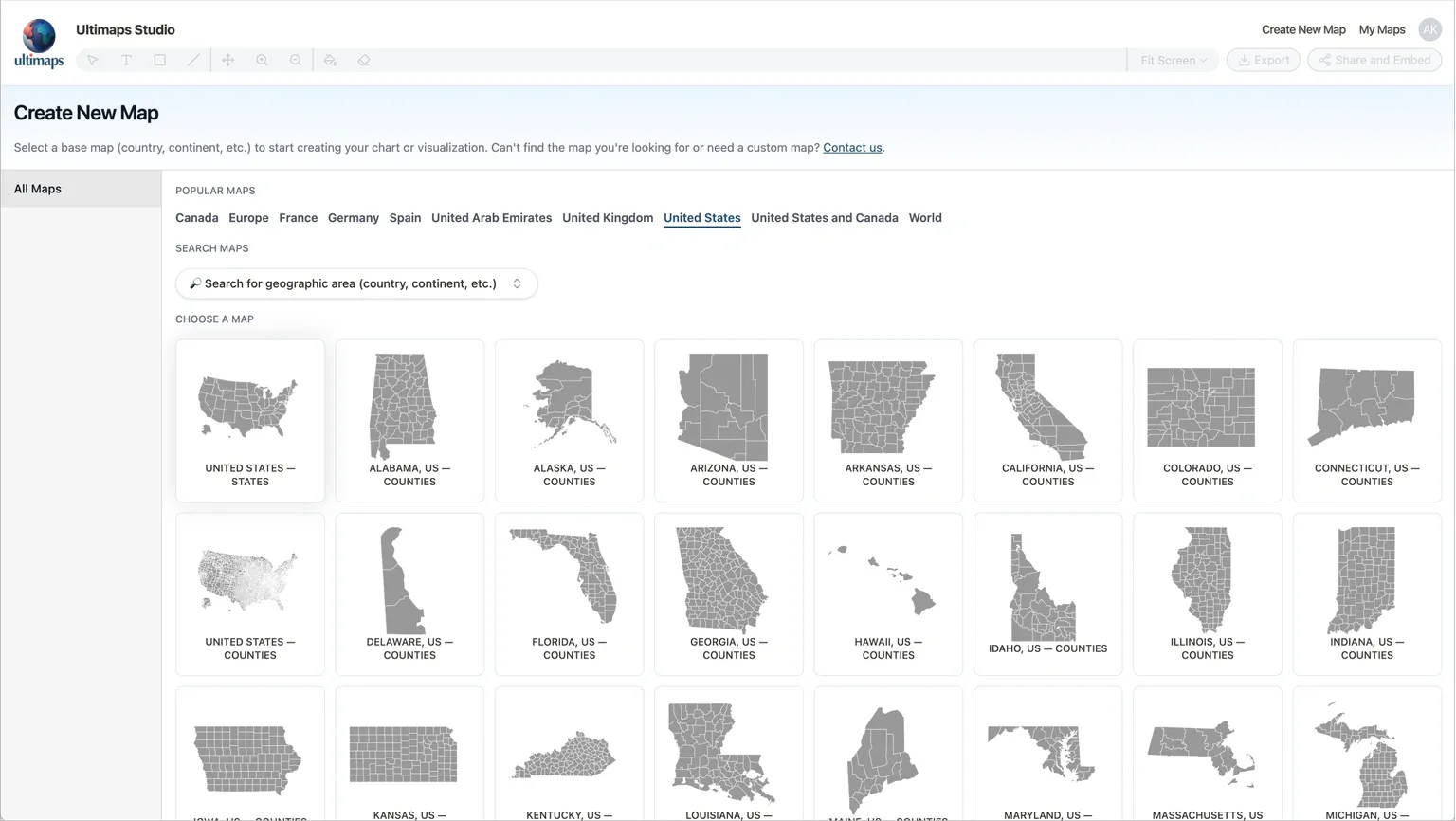
Go to studio.ultimaps.com. No signup needed.
You'll see the Create New Map page with popular maps and a search bar. Pick a base map that matches the regions you want to show. For this guide, select United States - States.
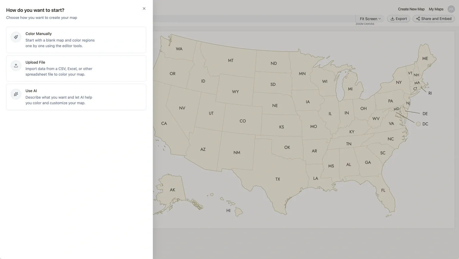
After you select a base map, the Studio opens with a blank map and a dialog asking how you want to color it. You have three options: Color map manually, Import Data, or Use AI.
2. Color your map
The dialog you see after picking a base map gives you three ways to get started. Here's how each one works.
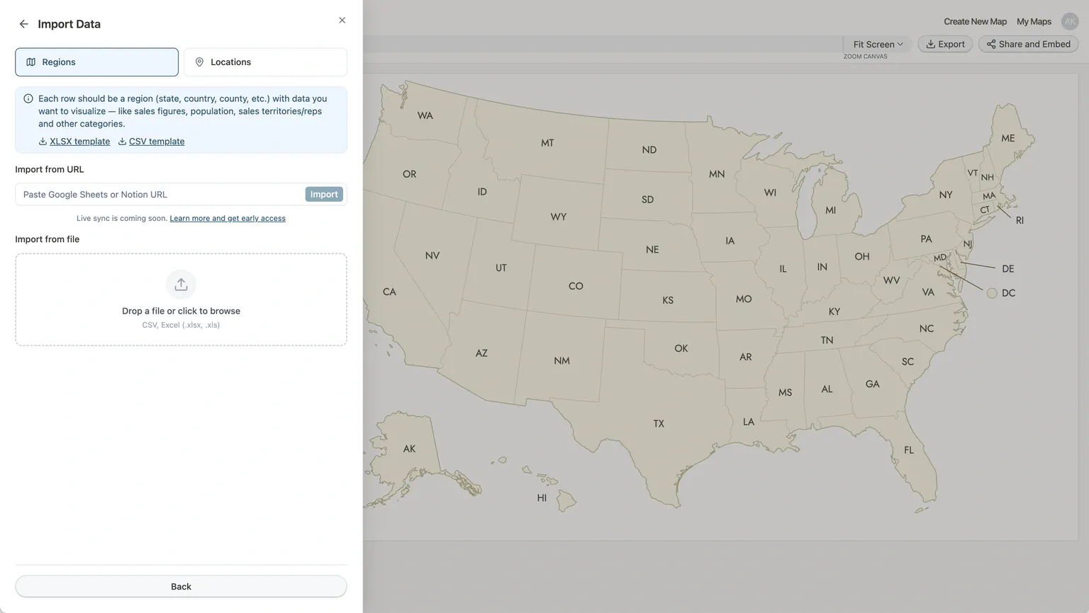
Import a spreadsheet
Best when you already have data in a file or Google Sheets.
- Click Import Data in the initial dialog (or later via the Regions tab by clicking Import Data button).
- Stay on the Regions tab in the import dialog.
- Drop a CSV or Excel file into the upload area, or paste a Google Sheets URL and click Import.
Once your spreadsheet has been processed, you'll see a Review Data screen:
- Verify how many regions matched (e.g., "50 matched").
- Use the Color regions by dropdown to pick the column with your values.
- Under How to visualize numbers, select Color Gradient for numeric data. For text categories (like party names or sales reps), the system detects them automatically.
- Click confirm.
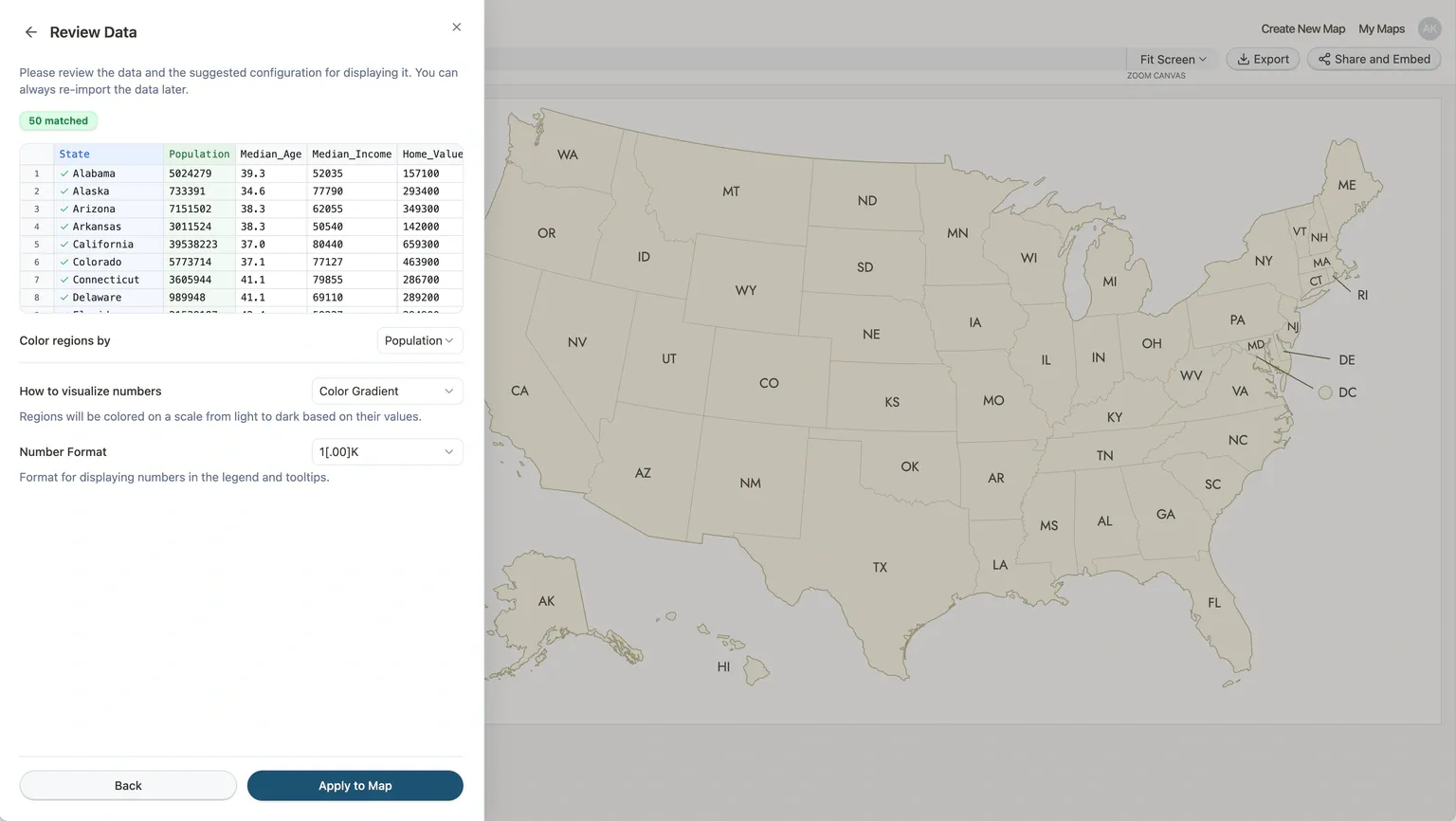
The map colors itself and generates a legend. The algorithm picks a palette, break method, and ranges automatically, so the result looks good right away.
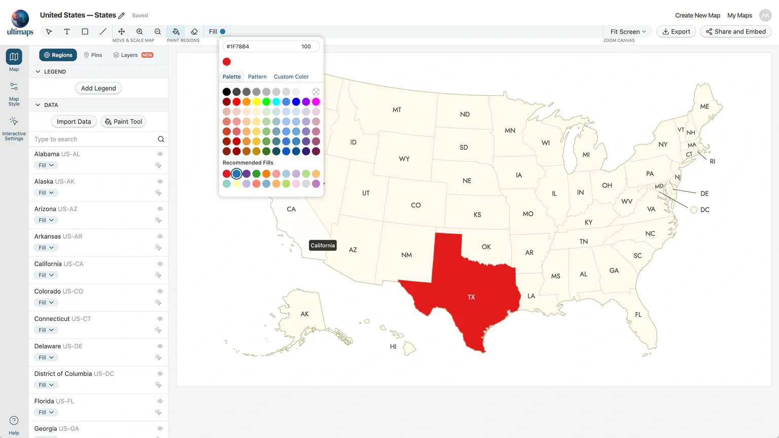
Paint regions by hand
Best for illustration maps where you want to handpick colors for specific regions.
- Click Color Map Manually in the initial dialog.
- Activate the Bucket Fill tool from the toolbar.
- Pick a color from the palette that appears.
- Click any region on the map to fill it.
- To remove a fill, switch to the Eraser (next to the Bucket Fill tool in the toolbar) and click the region. Alternatively, you can hold Shift button when the Bucket Fill tool is activated to reset the region's fill.
To add a legend for your hand-colored map, open the Map panel, go to the Regions tab, and under the Legend section click Add Legend. Add items with labels and matching colors.
Describe it with AI
Best when you don't have a file and want the AI to find or generate the data for you.
- Click Use AI in the initial dialog (or later via Import Data in the Regions tab).
- Type what you want. For example:
Create a map with the title: "Sales Territories Q1". Color it based on the data below: John Smith: California, Oregon, Washington; Sarah Jones: Texas, Oklahoma, Kansas, Nebraska; Mike Brown: New York, Pennsylvania, Florida, Georgia. Add pin for NYC headquarters - The AI generates the data, matches it to regions, and applies coloring.
- Review the result and adjust any regions or legend items as needed.
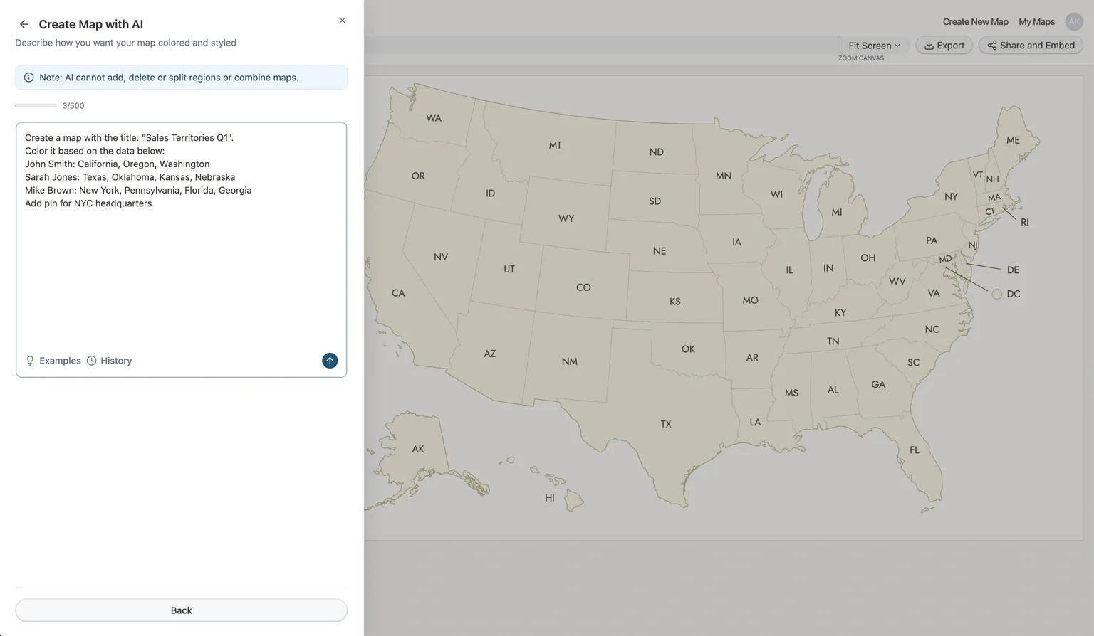
AI uses your monthly request quota: 20 requests/month on the Free plan, 500 on Pro.
3. Customize the look
Your map already looks good with the default settings, but you can change the theme, adjust choropleth settings, or tweak the canvas.
The left sidebar has three panels: Map, Map Style, and Interactive Settings.
- Open the Map Style panel.
- Under Theme, pick a visual theme. Click any thumbnail to apply it. Try Dark or Outline for a different feel.
- To change the canvas proportions, use the Aspect Ratio dropdown under the Canvas section (e.g., switch to Letter Landscape for printing).
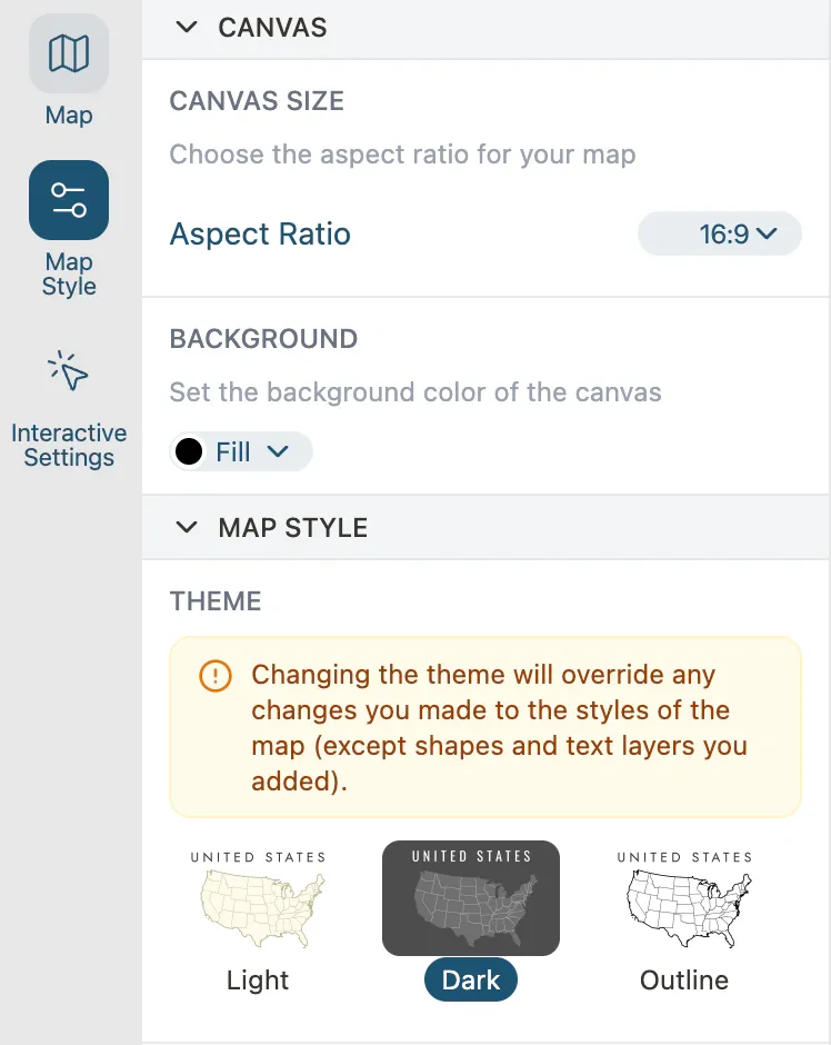
In the Map Style panel you can also fine-tune the default region fills, borders and apply effects to your map, such as outer and inner shadows.
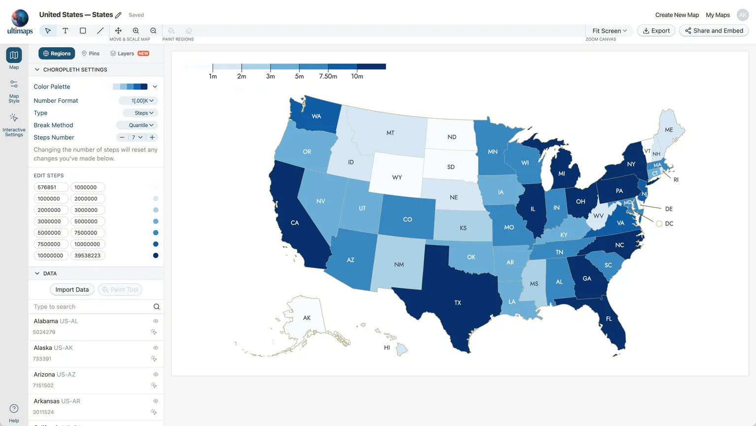
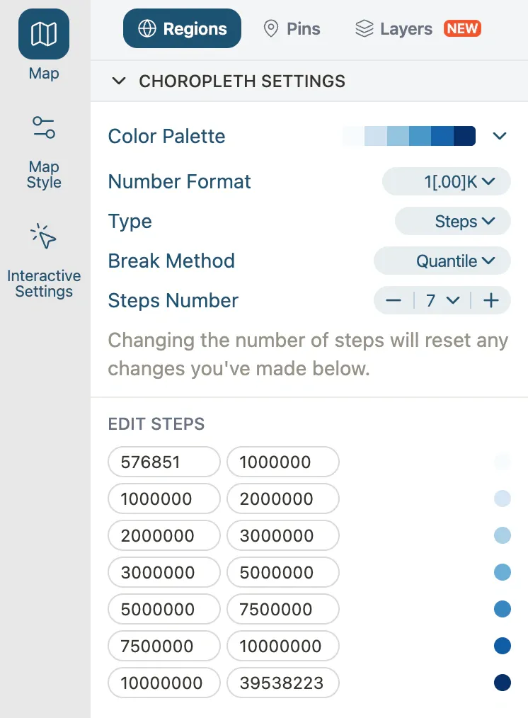
If you imported numeric data, you can fine-tune the choropleth in the Map panel under the Regions tab, in the Choropleth Settings section:
- Color Palette: swap to a different sequential or diverging palette.
- Type: switch between Gradient, Steps, or Groups.
- Break Method (for Steps/Groups): Pretty, Equal Interval, Quantile, Jenks Natural, or Custom.
You don't need to touch any of these. The defaults are designed to produce a clean result. Only adjust if your data or use case calls for it.
4. Export your map
- Click Export in the top toolbar.
- Pick the export quality:
- Standard (Free): Standard resolution, includes "made with ultimaps.com" attribution.
- Professional: PNG, SVG or PDF formats, 6x higher resolution than Standard, no attribution.
- Click Download and the file downloads.
If you only need one map without a watermark, a one-time payment of €9.90 gives you unlimited high-resolution, attribution-free exports for that map within 24 hours.
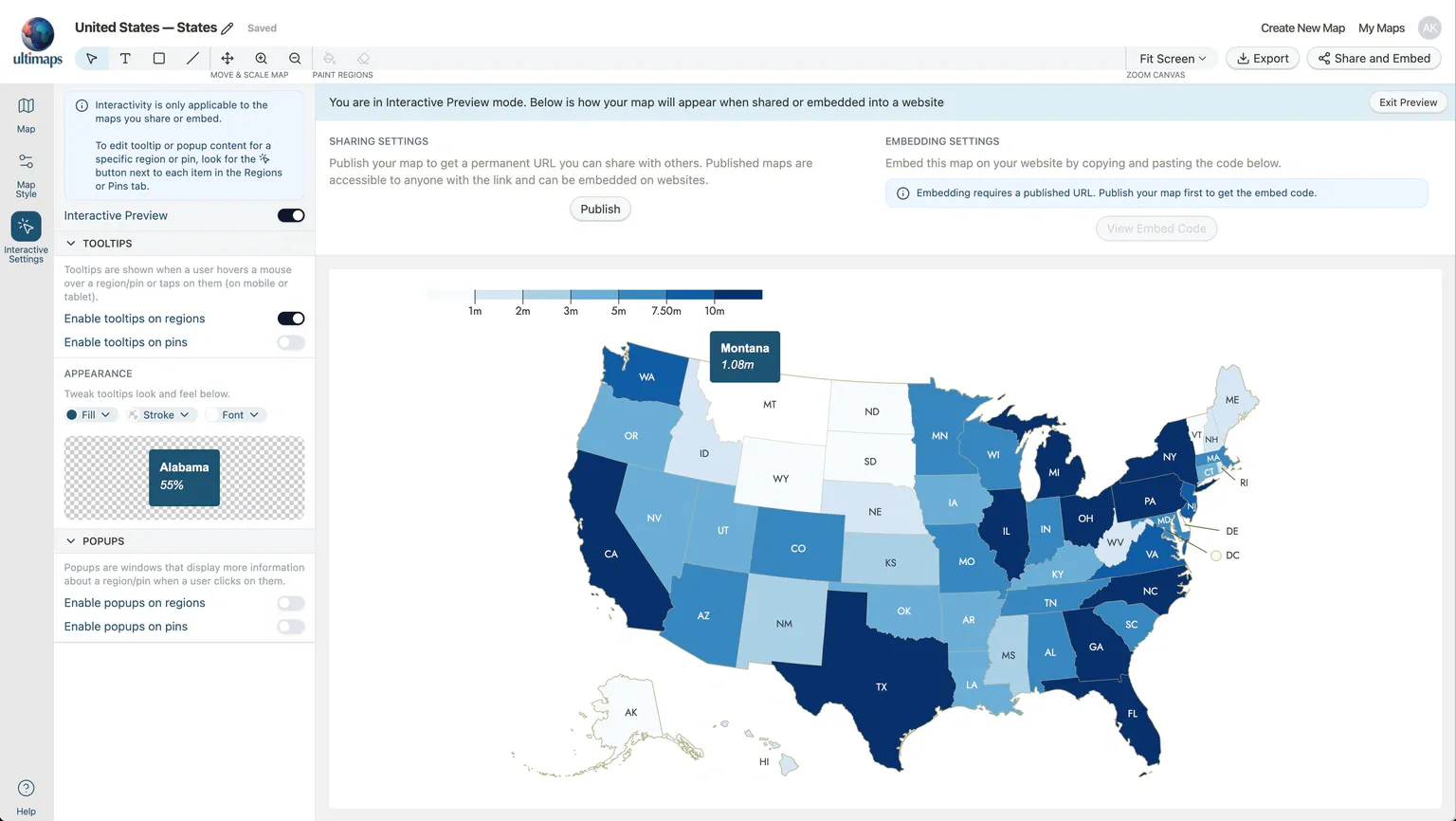
5. Share or embed (optional)
If you want your map to be interactive on the web, with tooltips that show data on hover, you can publish and embed it. This requires a free account.
- Open the Interactive Settings panel (cursor icon in the left sidebar).
- Under Tooltips, toggle Enable tooltips on regions. If you imported data, tooltips automatically show the region name and value.
- Turn on Interactive Preview at the top of the panel to see how it looks and feels.
- When you're happy with the preview, click Publish in the sharing settings on the right.
- Copy the shareable link, or click View Embed Code to get an iframe snippet for your website.
What's next
Try it yourself at studio.ultimaps.com.