The Complete Guide to Colorful US Maps: From Historical Atlas to Modern Visualization
Ultimaps Studio is a map visualization tool that allows you to create and customize maps and charts right in your browser. Sign-up is not required.
The Evolution of US Map Visualization
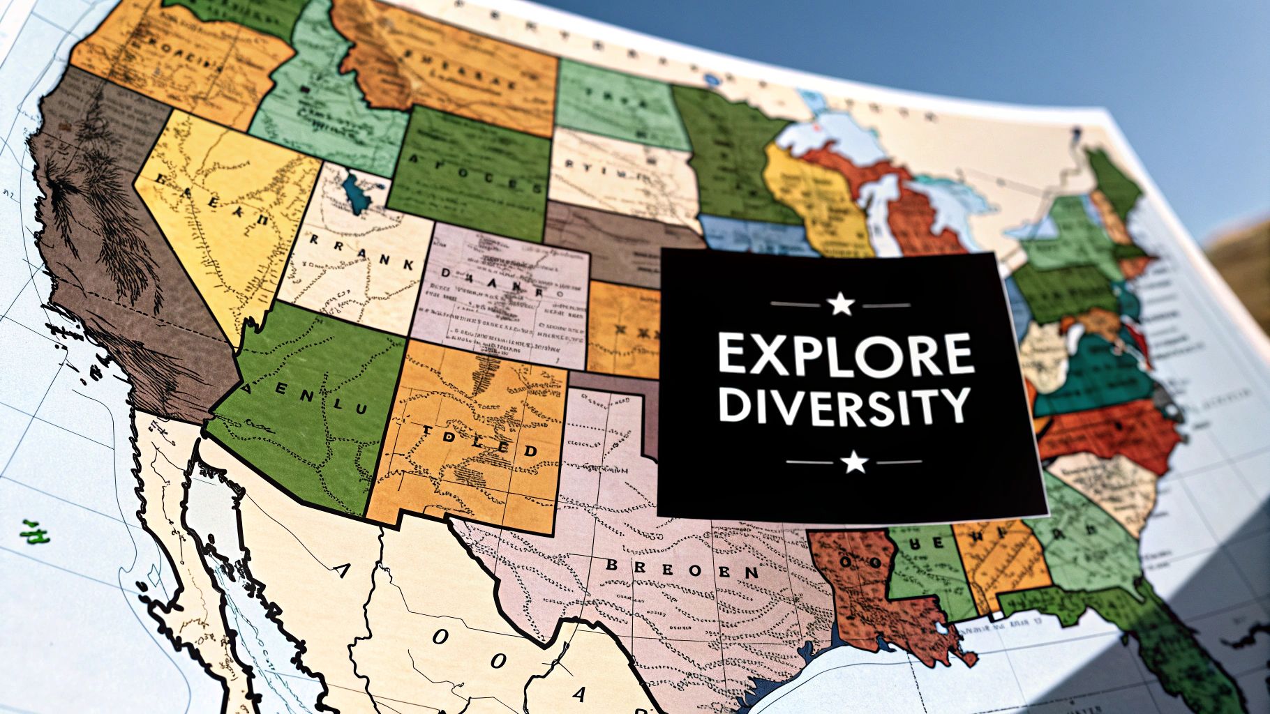
Early American maps were basic sketches focused on territories, borders, and landforms. These initial maps lacked the rich detail and visual depth common in today's maps, making it challenging for early cartographers to effectively communicate complex geographic information.
The rise of printing technology marked a key shift in map creation. This enabled mass production and the addition of color, making maps more informative and easier to understand. Different colors could now represent varying terrains, political boundaries, and population levels, helping make geographic data accessible to more people.
The Rise of Statistical Mapping
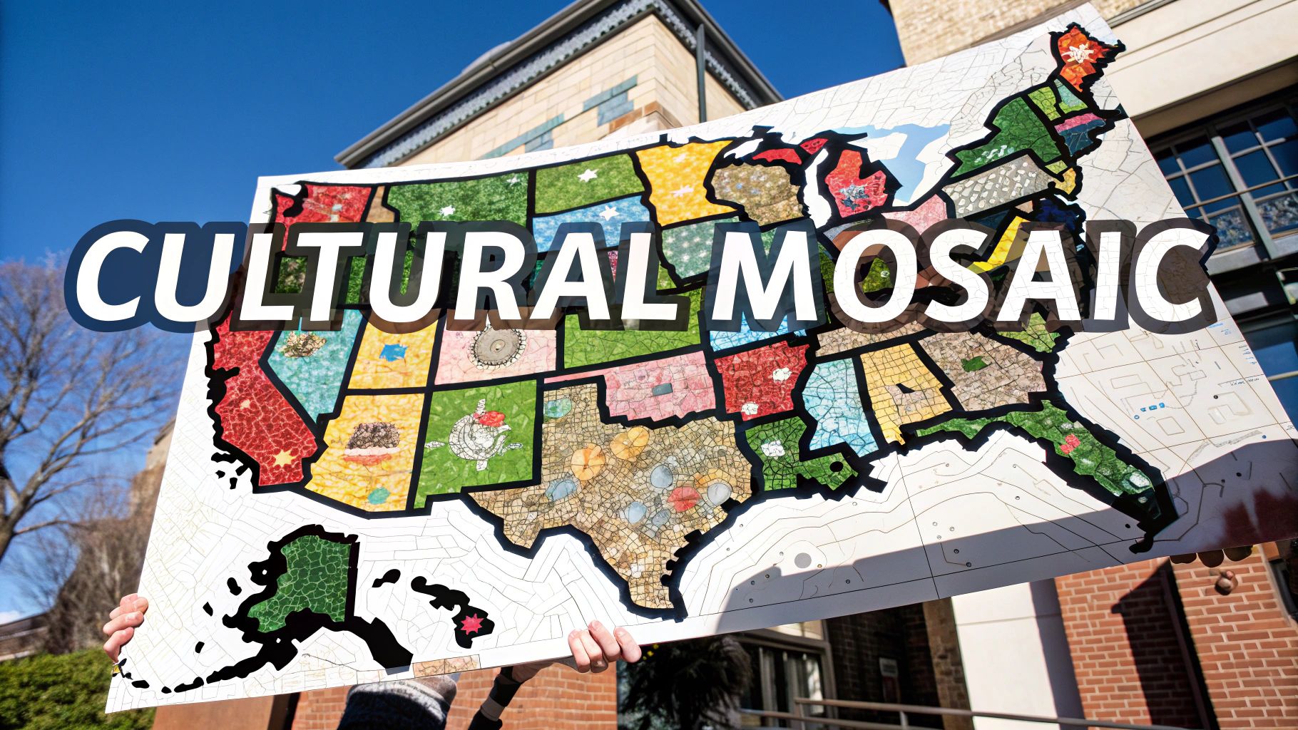
The addition of statistical data changed how maps conveyed information. Maps evolved beyond just showing locations to revealing complex patterns and stories through data visualization. The development of choropleth maps, which use shading to show data variations across regions, provided new ways to understand geographic trends.
A major milestone came in 1874 when the U.S. Census Bureau published its first 'Statistical Atlas of the United States' under Francis Walker's direction. This groundbreaking atlas tracked population movement westward and other key demographic shifts. More details are available at U.S. Census Bureau Historical Geographic Programs.
The Digital Revolution in Mapping
Digital tools and Geographic Information Systems (GIS) have created new possibilities for dynamic, interactive maps. Modern mapping software lets users build custom color-coded maps with multiple data layers and interactive features. This has made powerful mapping capabilities available to more people and organizations, changing how we analyze and share geographic data.
Modern Applications of Colorful US Maps
Today, color maps are essential tools across many fields. They help visualize election results, population trends, climate patterns, and urban planning projects. The ability to communicate complex information through well-designed color maps has become a key skill in many professions. These maps continue to evolve as valuable tools for analysis and decision-making.
Mastering Color Theory for Impactful Map Design
The art of creating beautiful, informative US maps depends heavily on understanding color theory. Your choice of colors directly impacts how effectively your map presents data. Making smart color choices is key to ensuring your map achieves its purpose.
The Psychology of Color
Colors can trigger specific emotional responses and mental associations. For instance, red tends to signal intensity or urgency, while blue often represents calmness and reliability. These built-in color associations shape how people absorb information from your map. This makes color psychology especially important when designing maps that need to convey specific messages.
Color Schemes for Clarity
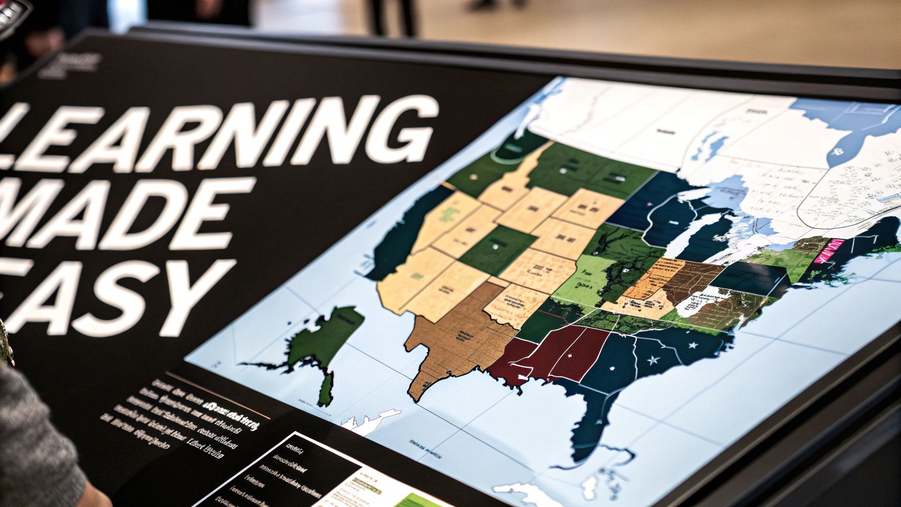
There are several proven color approaches that can make your US map more readable. Sequential schemes use varying shades of one color - perfect for showing data ranges like population density. Diverging schemes work with two contrasting colors meeting in the middle, ideal for election results or other data with opposing values. Qualitative schemes use distinct colors to represent different categories, like types of land use. Picking the right scheme ensures your map communicates clearly.
Accessibility and Inclusivity
Making maps accessible to everyone means considering color vision differences. 8% of men and 0.5% of women have some form of color blindness. This makes it essential to choose colors carefully and include patterns or textures to distinguish map elements. Tools like Ultimaps offer features to help create color palettes that work for all users.
Practical Tips for Color Selection
- Keep colors minimal: Using too many colors creates confusion. Stick to a focused palette with just the essential hues.
- Check your work: View your map on different screens and in various lighting to confirm the colors look right.
- Know your viewers: Different cultures may interpret colors differently. Choose colors that make sense for your target audience.
- Use available tools: Take advantage of color palette generators and map tools like Ultimaps to simplify color selection.
When you apply these color theory basics and use the right tools, you can create maps that clearly present information, draw in viewers, and work well for everyone who uses them.
Breakthrough Innovations in US Cartography
Breakthrough Innovations in US Cartography
The evolution of US cartography shows remarkable progress from basic drawings to detailed data visualizations. Map creation and interpretation have grown more sophisticated through innovations in techniques and technology. The shift from static paper maps to interactive digital formats marks a major advancement in how we engage with geographic information.
Early Advancements: Hand-Colored Maps and Atlases
The earliest US maps featured careful hand-coloring to highlight different features and improve visual understanding. Though time-intensive, this manual process allowed for precise detail that early printing could not match. The introduction of lithography in the 1800s was a game-changer, enabling mass production of detailed color maps at lower costs.
The Statistical Atlas: A Turning Point
Statistical mapping brought new depth to cartography by incorporating population and economic data. The 1898 Statistical Atlas of the United States was groundbreaking, with its 69 pages and 63 color plates showing detailed population patterns and demographics. You can explore this historic work at the Library of Congress. This data-focused approach set the stage for modern thematic mapping.
The Digital Revolution: GIS and Interactive Mapping
The rise of computers and Geographic Information Systems (GIS) brought major changes to map creation. GIS tools enable complex data analysis and dynamic map generation. Interactive maps now let users customize views and explore data in new ways. Simple tools help more people create insightful map visualizations, making geographic information more accessible.
Modern Cartography: Dynamic Data Visualization
Today's maps serve as powerful tools across many fields - from city planning to public health research. They combine real-time data with advanced visualization methods to tell compelling stories. Smart color use helps viewers quickly grasp complex information patterns. Web-based platforms and mobile apps continue making geographic data more available, allowing broader engagement with maps as analytical and communication tools.
Essential Digital Tools for Modern Map Creation
Creating compelling US maps for election results, population data, or climate trends requires effective digital tools. Here's an overview of the key software and platforms that can help you create clear and informative maps.
GIS Software: The Foundation of Modern Cartography
Geographic Information Systems (GIS) software is essential for professional map creation. Tools like ArcGIS Pro and QGIS offer robust features for analyzing spatial data and designing detailed maps. These platforms provide precise control over map elements like symbols, labels, and projections. While powerful, they do require time to master.
User-Friendly Mapping Platforms: Simple Yet Effective
For those new to map creation, platforms like Ultimaps offer an easier starting point. You can create interactive, color-coded maps without coding knowledge. Key features include automatic color-coding and the ability to import data from Excel and Google Sheets. The platform also supports interactive elements like tooltips to help users explore map data.
Data Visualization Tools: Making Data Clear
Platforms like Flourish and Datawrapper excel at presenting data visually through maps and charts. These tools include templates specifically designed for election maps and other data visualizations. They strike a good balance between ease of use and customization options, making them ideal for creating engaging maps even without extensive design experience.
Choosing the Right Tool: Finding Your Fit
The best mapping tool depends on your needs and technical background. GIS software offers the most complete feature set but requires more learning time. User-friendly platforms work well for quick visualizations, while data visualization tools provide a middle ground. Consider your project requirements and skill level when selecting a tool to create your US maps.
Strategic Color Implementation for Professional Maps
Making effective US maps requires thoughtful color choices that enhance understanding while maintaining visual appeal. The right color combinations can turn basic maps into powerful tools that clearly communicate complex information. Well-planned color usage separates expert cartography from basic mapping.
Understanding the Power of Color
Colors shape how we interpret map data and information. Different hues trigger specific associations - like red suggesting heat and blue indicating cold on temperature maps. However, using too many colors makes maps confusing and harder to read. The best maps use a focused, coordinated color palette.
Choosing the Right Color Scheme for Your Data
Several color approaches work well for US maps. Sequential schemes use varying shades of one color to show data ranges - perfect for things like population density maps, where lighter shades indicate lower numbers and darker shades show higher values.
Diverging schemes pair two contrasting colors that meet in the middle, often using white or gray as the midpoint. These work well for data with positive and negative values, like election results where blue and red represent different parties, becoming lighter as margins narrow.
Qualitative schemes apply distinct colors to different categories. This fits maps showing land use types, where separate colors indicate forests, farms, cities and water. Ultimaps lets you test various color combinations to find what works best for your data.
Ensuring Accessibility and Inclusivity in Your Colorful US Map
Color choices should consider people with color vision limitations. About 8% of men and 0.5% of women have some form of color blindness. Using carefully selected colors along with patterns or textures helps make map features clear to all users. Ultimaps includes tools for creating accessible color schemes.
Best Practices for Color Selection in US Maps
- Keep color palettes simple: Using fewer colors improves clarity. Too many colors distract and confuse.
- Check display variations: Colors look different across screens and lighting conditions. Test maps on multiple devices.
- Think about your users: Color meanings vary across cultures. Pick colors that suit your target audience.
- Use available tools: Ultimaps offers color-coding features for consistent designs, plus options for custom pins, drawings and fonts to enhance storytelling.
Following these color guidelines helps create US maps that are both attractive and informative. Tools like Ultimaps handle technical details so you can focus on presenting your data effectively.
Future Directions and Practical Applications
Modern mapping technology has made colorful US maps indispensable tools across many fields, from helping shape policy decisions to addressing complex societal challenges. These visualizations provide critical insights for everything from election analysis to climate studies.
Advancing Geographic Visualization
New technologies are changing how we view and understand geographic data. Interactive, 3D, and augmented reality maps now let users explore information in completely new ways. Instead of static images, people can now move through virtual spaces, work with different data layers, and better understand spatial relationships. For example, city planners use 3D modeling to see how new buildings might affect a city's profile and systems.
Data Integration and Analysis
Maps are increasingly connected to other data sources and analysis tools. By combining geographic data with population statistics, economic data, and social media trends, organizations gain deeper understanding of complex issues. The addition of artificial intelligence (AI) helps spot important patterns that humans might miss in large datasets.
Practical Applications Across Industries
These mapping tools serve essential functions in many fields. In public health, maps track disease spread and identify areas needing better healthcare access. Business intelligence teams use maps to study markets and improve delivery routes. Environmental scientists rely on color-coded maps to monitor land use changes and study climate impacts.
Emerging Trends in Cartographic Innovation
New developments are reshaping how we create and use maps. Open-source mapping tools make geographic data more accessible, allowing more people to build custom visualizations. The rise of data storytelling helps turn static maps into engaging narratives that clearly explain complex information.
Positioning Yourself at the Forefront
Success in modern cartography requires ongoing education and willingness to try new approaches. Key skills include learning different mapping platforms, understanding color theory, and staying current with industry changes. Ultimaps offers essential tools for making professional color-coded maps of the US. These resources help people and organizations create maps that effectively communicate their data.
To start making your own detailed, data-rich maps, visit Ultimaps. The platform's simple interface and advanced features make it easy to transform your data into clear, meaningful visualizations.
Published Feb 7, 2025