How to Visualise Data on Map: Inside the Expert's Guide to Geographic Visualization
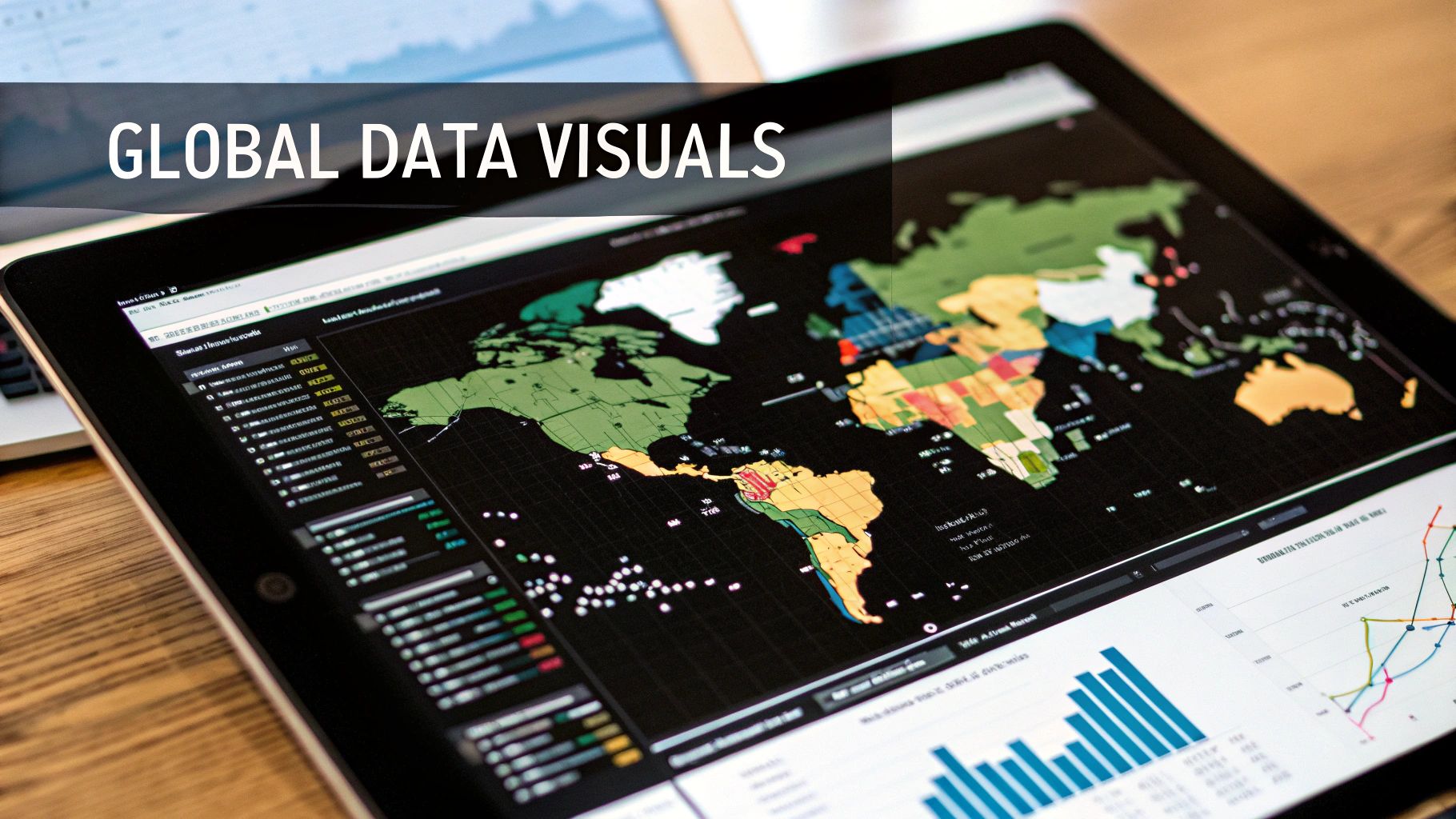
Ultimaps Studio is a map visualization tool that allows you to create and customize maps and charts right in your browser. Sign-up is not required.
The Evolution of Map-Based Data Visualization
Maps have come a long way from their early days as simple navigational tools. While ancient maps focused on showing physical features and borders, they gradually evolved into powerful instruments for understanding complex information. This shift marked the beginning of using maps not just to show where things are, but to reveal meaningful patterns in data.
A defining moment in this evolution came in 1854 with Dr. John Snow's groundbreaking cholera map of London. By plotting disease cases on a map, Snow identified a contaminated water pump as the outbreak source. This discovery led authorities to remove the pump handle, helping contain the epidemic. Learn more about these early innovations at Vizio. Snow's work showed how maps could uncover hidden insights and guide critical decisions.
From Static to Dynamic: The Rise of Technology
The 20th century brought major advances in map visualization tools. The introduction of computer-aided design (CAD) and Geographic Information Systems (GIS) enabled more detailed and accurate mapping. These tools made it possible to create thematic maps that highlighted specific data patterns like population changes or environmental trends. This progress moved mapping beyond basic location plotting into rich data analysis.
The Digital Revolution: Interactive and Accessible Maps
The spread of internet access and user-friendly software has made map-based visualization available to everyone. Modern platforms let users create interactive maps, add data layers, and share their work easily. Features like interactive tooltips, custom colors, and seamless data integration have made these tools both powerful and simple to use.
The Future of Visualizing Data on a Map: Integration and Exploration
Looking ahead, map visualization will keep getting better at combining different data sources and offering deeper analysis. The addition of AI-powered insights and real-time data feeds opens up new possibilities for dynamic, predictive mapping. As these tools continue to improve, maps remain essential for understanding and sharing information in meaningful geographic context. The field keeps growing, finding new ways to help us explore and understand our world through data.
Mastering the Art of Thematic Mapping
Maps do more than just show locations - they tell compelling stories through data visualization. By connecting numbers and statistics to specific geographic areas, thematic maps help us understand patterns, relationships, and trends across regions. Let's explore the key elements that make thematic maps effective tools for sharing insights.
Choosing the Right Map Type
The type of map you select shapes how your data story unfolds. Each style has strengths for showing different kinds of information:
- Choropleth Maps: Use color shading within defined boundaries (like states or counties) to show data values. These work well for statistics like population density or voting results.
- Heat Maps: Display data intensity through color gradients, with brighter "hot spots" showing higher concentrations. Perfect for visualizing things like crime rates or customer activity.
- Dot Density Maps: Place dots to represent individual data points. The clustering of dots reveals distribution patterns, making them ideal for tracking disease spread or business locations.
Data Representation: Color, Size, and Symbols
The visual elements you choose determine how clearly your data comes across. Color helps categorize information and show value ranges - for example, using darker shades for higher numbers. Size variations can represent quantity differences, like using larger circles for cities with more residents. Symbols and icons help distinguish between different types of data points, such as using distinct markers for various business types.
Telling a Story With Your Map
A great thematic map guides viewers through the data with purpose and clarity. Start with a descriptive title that previews the key message. Add legends and supporting text to explain what the colors, sizes, and symbols mean. Point out notable patterns or unexpected findings to help readers grasp the significance.
This approach to data visualization has deep roots - thematic cartography emerged in the early 1800s when mapmakers began focusing on specific themes like population patterns. Pioneers like William Playfair helped establish these techniques by mapping economic data in the late 18th century. Learn more about this history in this fascinating paper on data visualization's evolution.
Today's mapping tools make it easier than ever to create engaging thematic maps that transform raw geographic data into meaningful insights. By applying these core principles thoughtfully, you can craft maps that both inform and captivate your audience.
Navigating Modern Mapping Tools and Technologies

Creating effective map visualizations requires carefully choosing from the many mapping tools available today. Your choice should align with your specific goals, skill level, and data requirements. The key is finding the right balance between ease of use and powerful features that match your needs.
User-Friendly Mapping Solutions
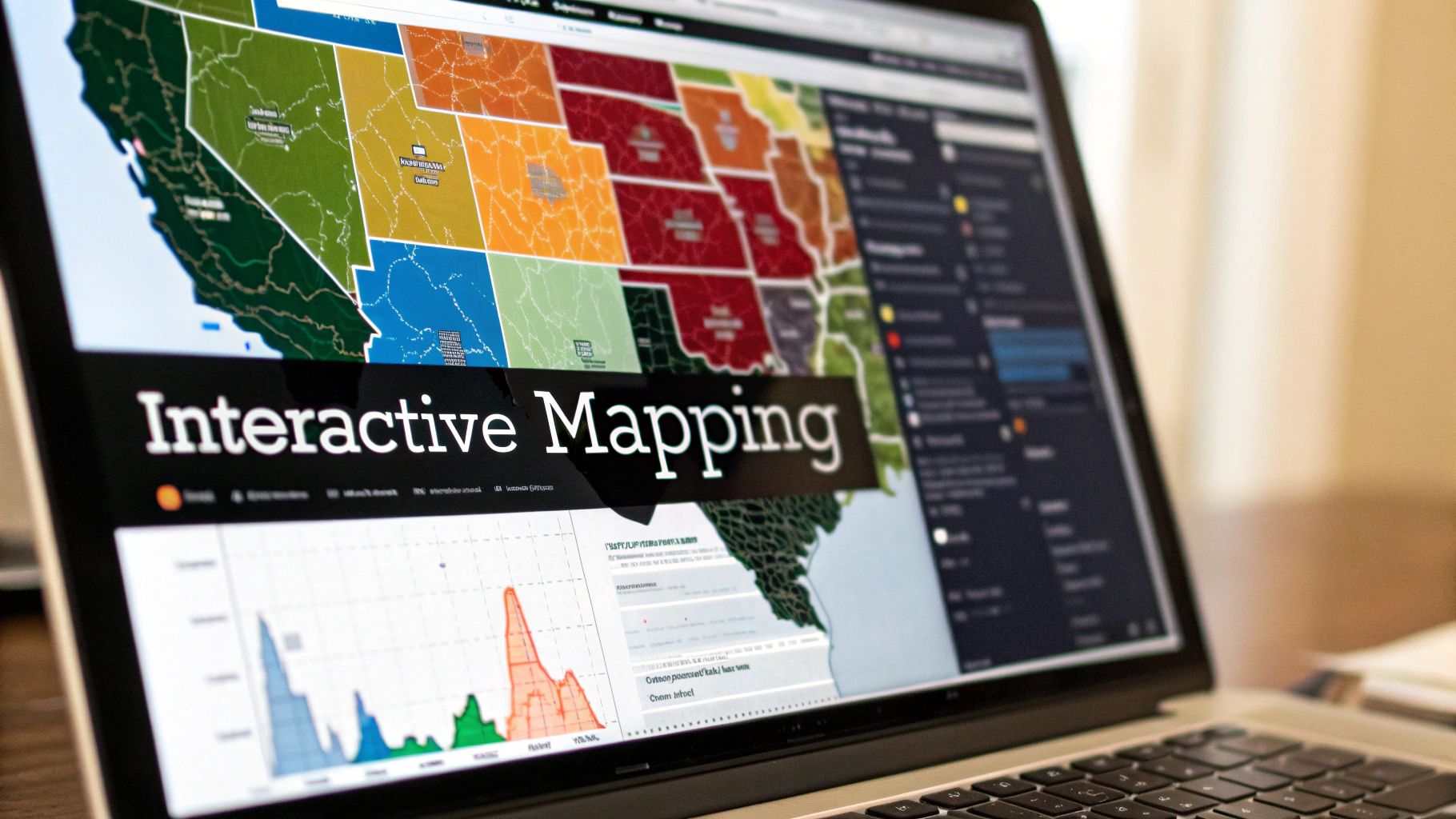
For those just starting with map visualization, Ultimaps offers an excellent entry point with its intuitive interface. You can create interactive, color-coded maps by simply importing data from Excel files and customizing elements like pins, drawings, and fonts. This makes map creation accessible even without coding knowledge.
Professional-Grade GIS Software
When you need more advanced capabilities, Geographic Information Systems (GIS) software like QGIS becomes essential. QGIS provides deep tools for analyzing and manipulating spatial data, including geoprocessing and complex queries. This makes it perfect for urban planners analyzing traffic patterns or infrastructure needs. For current applications in urban planning, check out more examples here.
Data Visualization Platforms With Mapping Capabilities
Tableau stands out as a powerful middle ground, combining user-friendly design with robust analytics. You can easily connect various data sources and build interactive dashboards that feature maps alongside other visualizations. This makes it ideal for presenting geographic insights as part of a larger data story.
Combining Tools for Maximum Impact
The most effective approach often involves using multiple tools together. For instance, you might process raw data in QGIS, create interactive visualizations in Tableau, and quickly share custom maps through Ultimaps. This combination lets you take advantage of each tool's strengths while overcoming their individual limitations.
Choosing the Best Fit for Your Needs
Consider these key factors when selecting mapping tools:
- Technical Skill Level: Evaluate your comfort with coding and complex software
- Project Requirements: List specific needs like data import options and analysis features
- Scalability: Ensure the tool can grow with your needs and handle larger datasets
By carefully weighing these factors, you can select mapping tools that truly match your goals and help you create clear, impactful geographic visualizations.
Strategic Data Preparation and Quality Control

Creating clear and accurate map visualizations starts with properly preparing and validating your data. This involves carefully transforming raw information into a format that works well for mapping while maintaining data quality throughout the process. Getting these foundational steps right makes it possible to create maps that provide genuine insights.
Data Standardization: The Foundation for Consistency
When working with data from multiple sources, you'll often encounter different formats for dates, addresses, and numbers. The first step is getting everything into a consistent format. For example, all dates should follow one pattern like YYYY-MM-DD, and geographic coordinates should use the same system (such as decimal degrees). Standardized formatting makes it simple to import data into mapping tools like Ultimaps without issues.
Data Cleaning: Addressing Errors and Gaps
Just like polishing a gemstone reveals its true beauty, thorough data cleaning removes flaws that could impact your visualizations. This involves spotting and fixing errors, dealing with missing information, and eliminating duplicate entries. You can use data validation rules to catch inconsistencies or write scripts to automatically fix common problems. For mapping projects specifically, missing location data often requires geocoding or estimation to fill the gaps.
Geocoding: Linking Data to Geographic Locations
Geocoding converts text-based location information like addresses into precise map coordinates. This step is essential for placing data points in the right spots on your map. When your dataset includes addresses rather than coordinates, services like the HERE Geocoder API can automatically convert them into mappable locations. This ensures every point appears exactly where it should.
Quality Control: Validating and Refining the Data
Regular quality checks throughout the data preparation process help catch issues early. This means verifying data against known standards, confirming geographic accuracy, and checking that everything makes logical sense. Tools like Ultimaps simplify this process by making it easy to import data directly from Excel and Google Sheets, reducing the chance of manual errors.
Automation and Scaling: Maintaining Efficiency
As your mapping projects grow larger, automating routine data tasks becomes increasingly important. Setting up tools and scripts to handle standardization, cleaning, and validation saves time and reduces manual work. This allows you to focus more on analyzing the data and creating insightful visualizations. Automation helps maintain consistent data quality even when working with large datasets.
Crafting Visually Compelling Map Designs
A well-designed map does much more than simply display data points - it tells a story through thoughtful visual choices. The way color, typography, and layout come together guides viewers to understand complex information at a glance. When these design elements work in harmony, raw data transforms into meaningful insights that resonate with your audience.
The Power of Color
Color is one of the most important tools for making data clear and meaningful on maps. A sequential color scheme uses light to dark shades of one color to show data values, making it easy to spot patterns and trends. For data that centers around a midpoint, diverging color schemes use two contrasting colors to highlight differences above and below that threshold - perfect for showing temperature variations or demographic shifts. To simplify color choices, Ultimaps provides tested color palettes designed specifically for different types of map data.
Typography and Labels
The right text elements make maps both readable and professional. Start by choosing a legible font that matches your map's overall style. Create label hierarchy by varying font sizes and weights - larger text for major features like country names, smaller for cities and details. This natural visual order helps viewers focus on what matters most. With Ultimaps, you can fine-tune fonts and label styles to achieve the perfect balance of form and function.
Visual Hierarchy: Guiding the Viewer's Eye
Just like a well-composed photograph, maps need clear focal points that lead viewers through the information. By carefully sizing and highlighting key elements while de-emphasizing secondary details, you create an intuitive viewing path. For instance, using larger markers for major cities immediately draws attention to population centers. The tools in Ultimaps make it simple to adjust these visual cues and ensure your key message comes through clearly.
Legends and Annotations
A good legend acts as a map's instruction manual, explaining what each symbol and color means. Keep it simple and place it where it's easy to find. Add annotations - brief text callouts that highlight important points - to provide helpful context. Together, these elements turn your visualization into a story that viewers can follow. Ultimaps provides flexible tools for creating clear, customized legends that make your maps accessible to any audience.
When you thoughtfully combine these design principles, you create maps that both look great and communicate effectively. Following these best practices helps you turn complex spatial data into compelling visuals that engage viewers and make information memorable.
Advancing Geographic Visualization
Geographic visualization is reaching new levels with tools that make maps more powerful and meaningful. These improvements help us better understand complex data and find insights that were previously hard to spot. Let's explore the key developments shaping how we visualize geographic information.
Interactive Mapping and Real-Time Data
Modern maps do much more than just show static information. Today's interactive features let users zoom, pan, and click on data points to explore details that interest them. Many maps now incorporate real-time data feeds that show events as they happen, from traffic patterns to weather changes. Tools like Ultimaps make it simple to create these dynamic maps, helping users understand complex information more easily.
Big Spatial Data and AI-Driven Insights
We now have access to more geographic data than ever before. To handle this massive amount of information, new methods like cloud processing and distributed computing have become essential. AI and machine learning help spot patterns and trends that humans might miss. This means maps can not only show current conditions but also help predict what might happen next in specific locations.
Immersive Geographic Experiences
Virtual reality (VR) and augmented reality (AR) are changing how we experience geographic data. These technologies create immersive experiences that let users step into their data and see it from new angles. Picture walking through a 3D city model with live traffic data floating above the streets, or watching environmental changes unfold in a virtual landscape. These tools open up new ways to understand and share location-based information.
Essential Skills and Technologies
Success in geographic visualization requires both technical knowledge and practical understanding. Key skills include GIS software, data analysis, and programming. Just as important is the ability to understand what different industries need and to present complex data in clear, useful ways. This combination of skills helps create maps that tell meaningful stories and provide real value.
Ready to create maps that inform and engage? Start building your geographic visualizations with Ultimaps today.
Published Feb 4, 2025