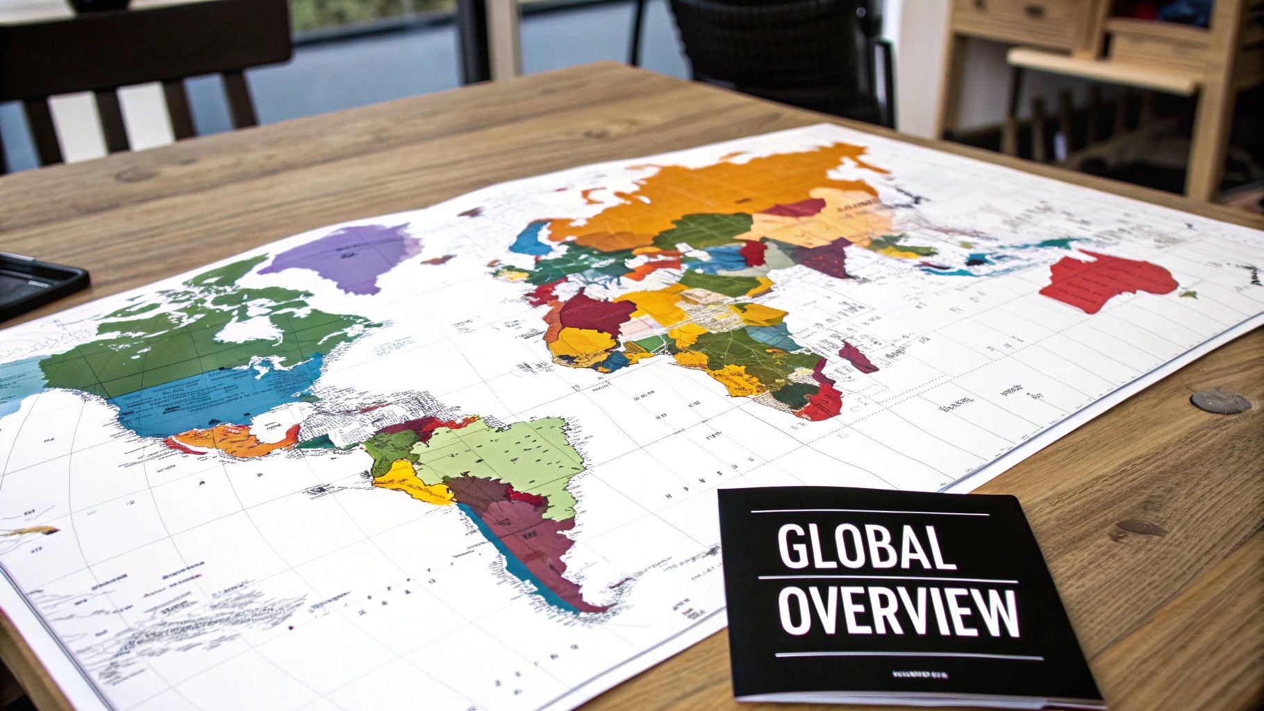
World Map By Color: A Comprehensive Guide to Modern Cartographic Design
Ultimaps Studio is a map visualization tool that allows you to create and customize maps and charts right in your browser. Sign-up is not required.
The Evolution of Color in World Maps
The earliest world maps used basic monochrome designs with simple lines and shading. Color served mainly as decoration around borders and illustrations rather than conveying geographic data. This basic approach meant maps could only show limited information.
A major shift occurred when mapmakers began using color to represent different geographic features. By assigning specific colors to show political boundaries, water bodies, and terrain, maps became much clearer and could display more complex information. For example, blue became the standard for water features, while green indicated vegetation and brown showed mountains.
The invention of chromolithography in 1850 marked a turning point in map coloring technology. This printing advancement expanded the possibilities for using color in maps dramatically. By the 19th century, color had evolved from decoration to an essential tool for data visualization, particularly in choropleth maps. The first choropleth map was created in 1826 to show education levels across France.
The Rise of Thematic Mapping
Thematic maps, which focus on specific geographic data, gained new capabilities through chromolithography's expanded color options. Mapmakers could now show detailed information about population density, economic activity, and disease spread using different color shades.
Take population density maps as an example. Using varying shades of a single color, with darker tones showing higher density areas, gives viewers an instant understanding of population distribution. Adding different color families for various population ranges provides even more detailed information.
Modern Color in Digital Mapping
Current digital mapping tools provide extensive options for creating color-coded maps. These tools offer wide color selections and customization features, making it simple to produce clear and informative world maps. The ongoing changes in how we use color in maps shows its key role in sharing complex geographic information effectively. From simple decoration to sophisticated data visualization, color remains essential to modern mapmaking.
The Science Behind Color Selection in Maps
Making a world map involves thoughtful color choices that go beyond just picking pretty colors. The process combines cartographic principles with color theory to effectively share information. Map creators need to think carefully about how colors work together, how easy they are to read, and how they can highlight important details on the map. This careful balance serves both visual appeal and clear communication.
Color Psychology and Perception
Colors affect our understanding in specific ways. For example, we tend to connect red with warmth or warning signs, blue with cold temperatures or bodies of water, and green with vegetation and nature. Map creators use these built-in associations to make maps easier to understand. Take a temperature map - using blue for cold regions and red for hot areas makes perfect sense to viewers, as it matches how we naturally think about these colors.
Choosing the Right Color Scheme
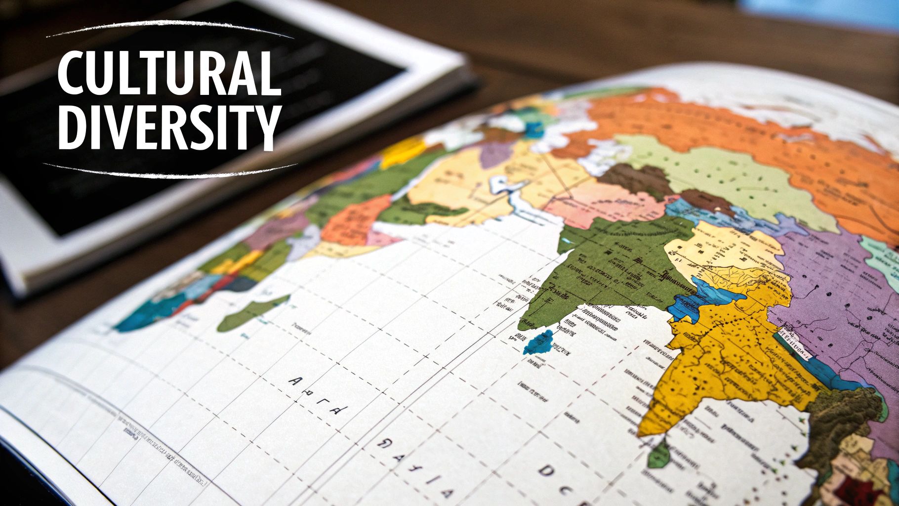
The type of data being shown determines which color scheme works best. For election maps, using different colors for each political party helps viewers quickly see voting patterns across regions. When showing data like population density or elevation changes, using lighter and darker shades of one color (a sequential scheme) works better. This approach helps readers spot patterns and trends across geographical areas. Learn more about effective map coloring at Morphocode's guide to color in maps.
Accessibility and Colorblindness
Making maps readable for people with colorblindness is crucial. About 8% of men and 0.5% of women have some form of color vision deficiency. Good map design includes choosing colors that remain distinct even for those who see colors differently. This means selecting color combinations that work for everyone, regardless of how they perceive color. Modern mapping tools can help create color palettes that are clear and readable for all users.
Technological Innovations Reshaping Color Mapping
The world of map creation has changed profoundly since the days of hand-drawn cartography. New digital tools have made it easier for mapmakers to present complex information through vibrant color schemes and intuitive designs. This shift has opened up map creation to a wider audience while improving how we visualize and understand geographic data.
The Digital Revolution in Cartography
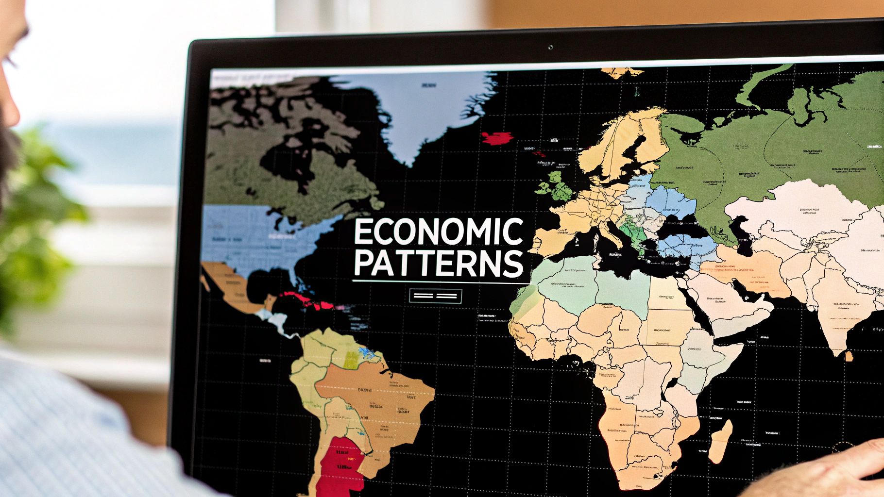
Modern mapping software gives creators precise control over every aspect of color. Features like custom color palettes, gradient effects, and opacity settings help highlight key data points effectively. For example, oceanographic maps often use subtle blue gradients to show water depth variations. Digital tools also make it simple to optimize colors for both print and screen viewing.
The Impact of AI and Automation
Artificial intelligence is bringing new capabilities to color mapping. Smart algorithms can now automatically select and optimize color schemes based on the data being shown. This saves significant time while ensuring consistency across large datasets. AI tools analyze patterns to suggest color combinations that maximize readability, letting analysts focus on interpreting the information rather than fine-tuning colors manually.
A major turning point came in 1856 with the invention of synthetic dyes, marking a shift from natural to manufactured colorants. These new petroleum-based dyes enabled large-scale map production with reliable, vibrant colors. By the mid-1900s, computer technology further refined color control in mapmaking. Learn more about this evolution in map coloring at the University of Michigan's online exhibit.
Interactive and Dynamic Maps
Modern mapping platforms like Ultimaps offer engaging ways to explore color-coded information. Users can hover over areas for tooltips, zoom in for details, and click regions to learn more. These interactive elements help people better understand complex data relationships. Ultimaps makes it possible for anyone to create custom interactive maps without coding knowledge, opening up data visualization to educators, businesses and individuals who need clear, impactful maps.
Advanced Data Visualization Through Color
Creating an effective world map requires thoughtful use of color to tell a clear data story. The key is selecting colors that help viewers quickly grasp complex information patterns across different regions.
Managing Multi-Layered Data
Maps often need to show multiple types of data at once, like population density and income levels. The secret is choosing complementary color schemes that keep each data layer distinct and readable. For example, varying shades of blue could show population density while shades of orange represent income levels.
A practical approach is using warm colors for one metric and cool colors for another. This clear visual separation helps readers understand each data layer without confusion or visual overload.
Selecting Appropriate Color Gradients
Color gradients shape how viewers interpret data. Sequential gradients use varying shades of one color to show progression from low to high values, perfect for metrics like temperature. Diverging gradients use two contrasting colors to highlight values above and below a midpoint, ideal for showing profit/loss data.
Data distribution plays a key role in color choices. When most values cluster around certain points, standard min-max color ranges can hide important patterns. Using quartiles or quintiles creates more balanced color breaks that reveal subtle data variations. Learn more about color palette selection for maps from Datawrapper's guide on choropleth map colors.
Maintaining Visual Engagement and Clarity
The best color-coded maps balance information richness with visual simplicity. Using too many colors can overwhelm viewers and hide key insights. Stick to a focused color palette and clear labels to keep maps readable and useful.
Adding interactive elements like tooltips lets users explore data details on demand. This gives viewers control over their map experience while keeping the main view clean and approachable. The right mix of color choices and interactivity turns complex data into an engaging visual story that viewers can easily understand.
Creating Professional Color-Based World Maps
Color is a powerful tool for making maps that communicate complex information clearly. When used effectively, color helps viewers understand and interpret the data being presented while making the map visually engaging.
Planning Your Map's Purpose and Audience
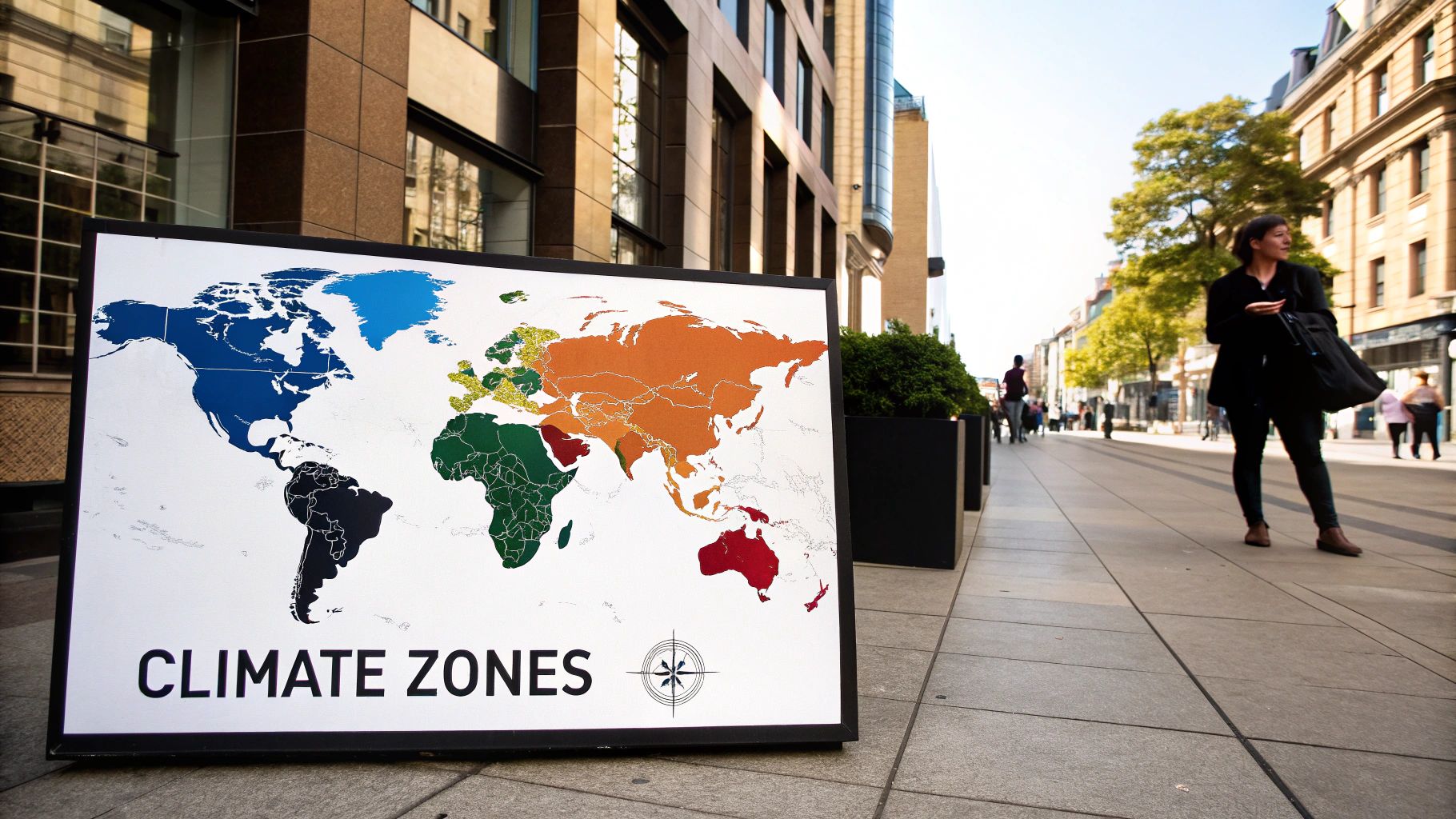
Start by identifying exactly what information your map needs to convey. Are you showing election results, climate data, or demographic patterns? Your goal determines what color approach will work best. For instance, election maps often use distinct colors for different political parties, while temperature maps work better with color gradients.
Consider who will be using your map. A children's educational map might use bright, bold colors, while a business presentation may call for more subdued professional tones. Understanding your audience helps guide smart color choices that resonate with viewers.
Step-by-Step Color Selection Process
Follow a systematic approach when choosing map colors:
-
Start with a core color palette using tools like Adobe Color or Coolors to generate balanced color combinations. The Ultimaps platform makes this easier with automatic color-coding features.
-
Assign colors logically to your data categories. Make sure adjacent regions have enough contrast to be easily distinguished. For example, when mapping biomes, use greens for forests, browns for deserts, and blues for water bodies.
Making Maps Accessible to All
Color accessibility matters greatly in map design. Choose colors that remain distinct for people with color vision deficiencies. Tools like Ultimaps provide pre-tested colorblind-friendly palettes to ensure your maps work for everyone.
Add clear labels and legends to support the color coding. Use legible fonts and appropriate text sizes that stand out against the colored backgrounds. This helps all users correctly interpret the information regardless of their visual abilities.
Consistent Colors Across All Uses
Your map may appear in print, on screens, and across different devices. Test that your chosen colors maintain their clarity and meaning across all these formats. Ultimaps helps optimize maps for both digital sharing and print output, ensuring your message stays clear no matter how people view it.
By following these guidelines and using helpful tools, you can create maps that effectively communicate through color while remaining accessible and professional across all platforms and uses.
The Future of Color in Digital Cartography
Maps continue to advance through the latest innovations in how we apply and experience color. These changes expand what's possible when visualizing and exploring geographic data in compelling new ways.
Immersive Experiences with AR/VR
Augmented Reality (AR) and Virtual Reality (VR) bring fresh perspectives to color-coded maps. Picture exploring virtual terrain where green hues show elevation changes, or seeing real-time traffic updates projected onto city streets through a color spectrum. AR can layer interactive maps onto physical spaces, helping us better grasp our surroundings. These tools create rich, dimensional experiences beyond traditional flat maps.
Machine Learning and Automated Color Optimization
AI and machine learning now help pick optimal color schemes for maps automatically. Smart algorithms can process large datasets to suggest color combinations that make patterns clear and readable. For example, an AI system could analyze global temperatures and create color gradients that effectively show climate variations while maintaining visual clarity across regions. This frees up map creators to focus on the meaning behind the data rather than manual color selection.
Interactive Visualization and Dynamic Storytelling
Interactive features have changed how we explore color-coded maps. Ultimaps lets users dive into data through tooltips, zoom controls, and clickable areas that reveal deeper details. Maps become dynamic tools for telling data stories rather than static images. For instance, users viewing population density can click countries to see demographic breakdowns in color-coded charts. This interactivity makes exploring geographic data more engaging and accessible.
Ultimaps gives users the tools to build compelling interactive maps without coding knowledge. Whether you work in data analysis, marketing, education or business, Ultimaps helps bring your data to life through color. Start creating interactive maps today and discover effective ways to tell stories through color-coded visualization with Ultimaps.
Published Feb 14, 2025